Business Intelligence Consulting & Analytics
We develop enterprise-level dashboards for hundreds of software platforms.

01 | Our services
Microsoft™ Power BI Experts
Our team of Microsoft Certified Power BI analysts and Azure data engineers deliver easy-to-use, customizable dashboards and reports that allow you to measure, manage and improve performance across your entire organization.

Business intelligence is simple but it’s not easy.
Our team has the knowledge, experience and character needed to guide your analytics project to completion. We will help you design and implement a world-class BI strategy in the most cost-effective way possible.

Ready to take your business to an elite level and dominate your market?
Our enterprise-level analytics give you immediate access to the insights you need to make smart, data-driven decisions that improve your bottom line. You will identify ways to increase revenue, reduce expenses, minimize risk and save time.

You never have to go it alone.
Our Software as a Service (SaaS) business model means you have ongoing access to our expert analytics team. We’ll keep you informed of new features and best-practices, and provide one-on-one technical support should the need arise.

Business intelligence is simple but it’s not easy.
Our team has the knowledge, experience and character needed to guide your analytics project to completion. We will help you design and implement a world-class BI strategy in the most cost-effective way possible.

Ready to take your business to an elite level and dominate your market?
Our enterprise-level analytics give you immediate access to the insights you need to make smart, data-driven decisions that improve your bottom line. You will identify ways to increase revenue, reduce expenses, minimize risk and save time.

You never have to go it alone.
Our Software as a Service (SaaS) business model means you have ongoing access to our expert analytics team. We’ll keep you informed of new features and best-practices, and provide one-on-one technical support should the need arise.
02 | Field Service Software
Field Service Analytics
Gain even more value from your field service software investment by seamlessly integrating enterprise-level field service analytics built specifically for your business. Dozens of interactive, purpose-built dashboards give you the insight you need to make smart, proactive decisions that drive growth and profitability.
TGL Analysis
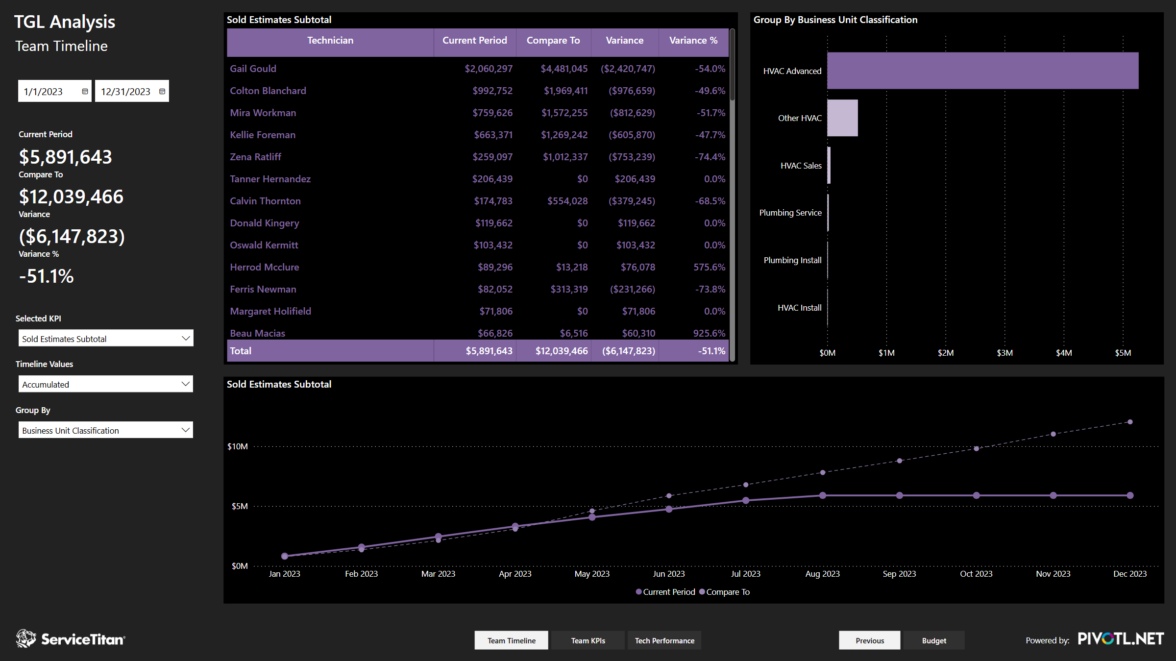
When technicians are performing at a high level, they’re generating new, quality leads for your business. Track how your technicians are bringing in leads with the Technician Generated Leads Analysis, where you can evaluate your techs’ efficacy in bringing new business to your field service company. Track the tech leads from start to finish, identify the types of leads, understand how and when they’re being generated, and eliminate roadblocks in your pipeline but examining technician response times.
Membership Analysis
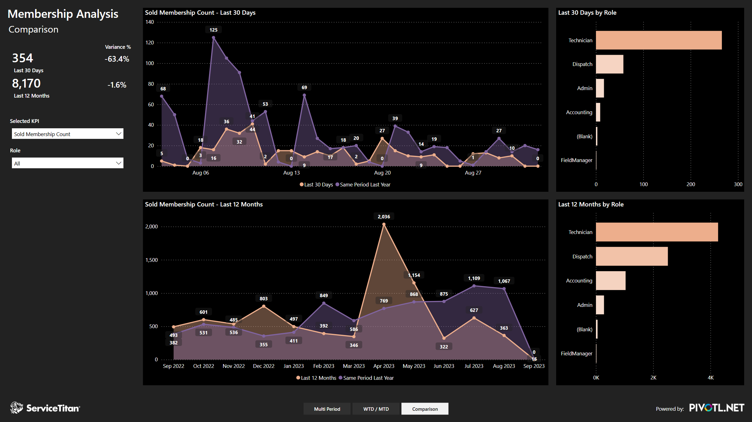
If your goals include selling and maintaining a robust membership program for your company, tracking the data around your memberships is crucial. The Membership Analysis module allows your team to track technician and office staff performance regarding the sale of new customer memberships, and evaluate trends relating to memberships sold and the clients within your database. Finally, track membership cancellations to pinpoint where you may be losing customers, and identify practices for client retention.
Leads Analysis
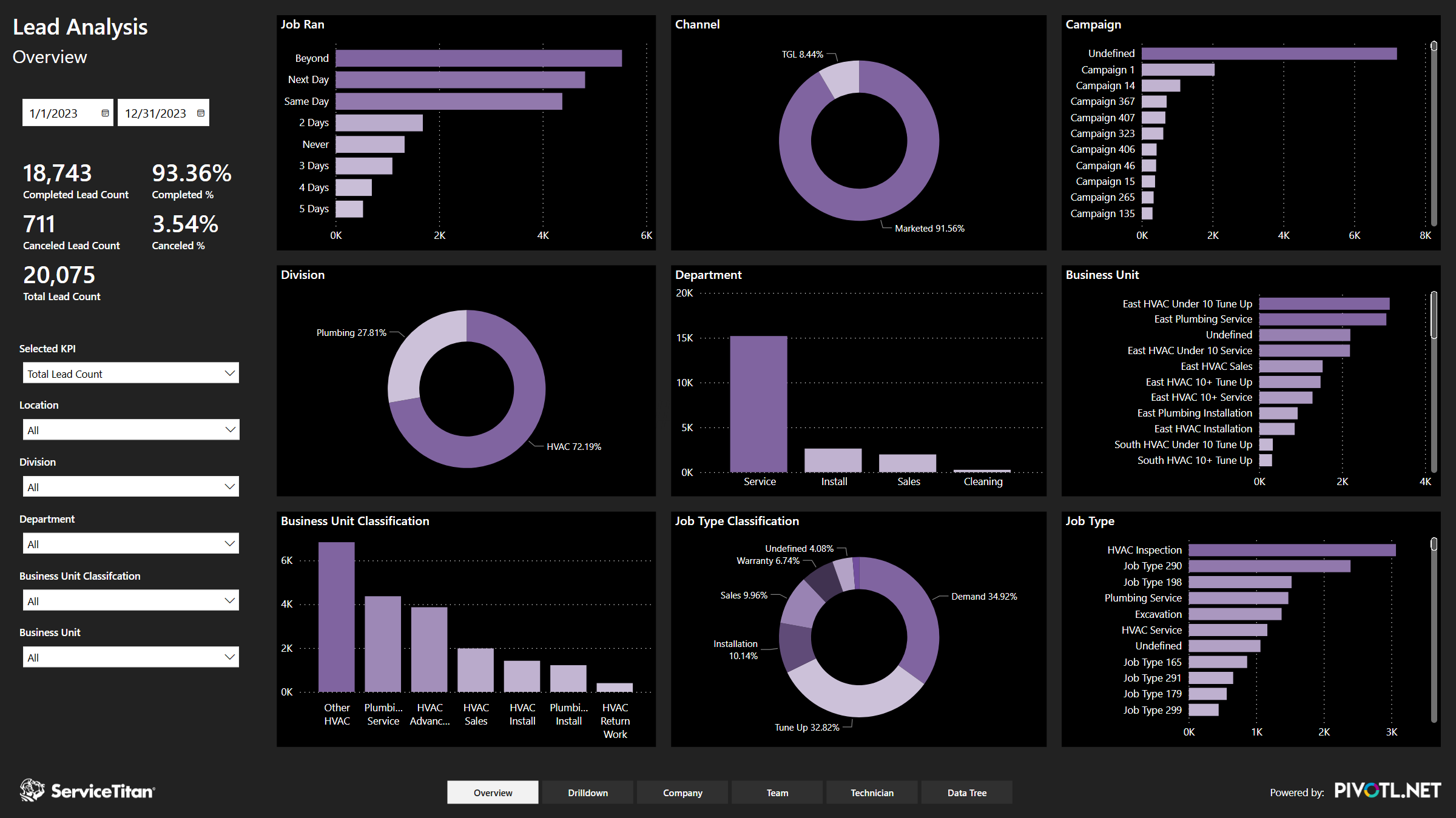
An in-depth analysis of lead sources can expose a wealth of valuable, actionable information for a field service company. The Lead Analysis allows business owners and lead gen teams to get a clear, accurate picture of the composition of leads the business is generating, and evaluate based on channel of origin, campaign, job type, business unit and much more. The Lead Analysis goes even deeper by uncovering conversion rates and average sales per job. Finally, get an overall picture of what leads have moved through to job completion, and what still needs your attention.
Tech Analysis
When you know how your technicians are performing, you can better understand the impact on your field service company, and set a management strategy that encourages high-quality service from your employees in the field. Managers that can accurately measure technician performance can reward techs that generate new leads and meet company targets, and seek training and alignment from technicians that need support in meeting their goals.
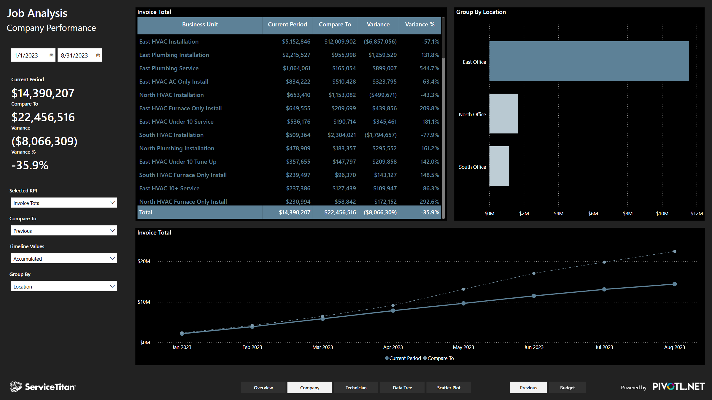
Job Analysis
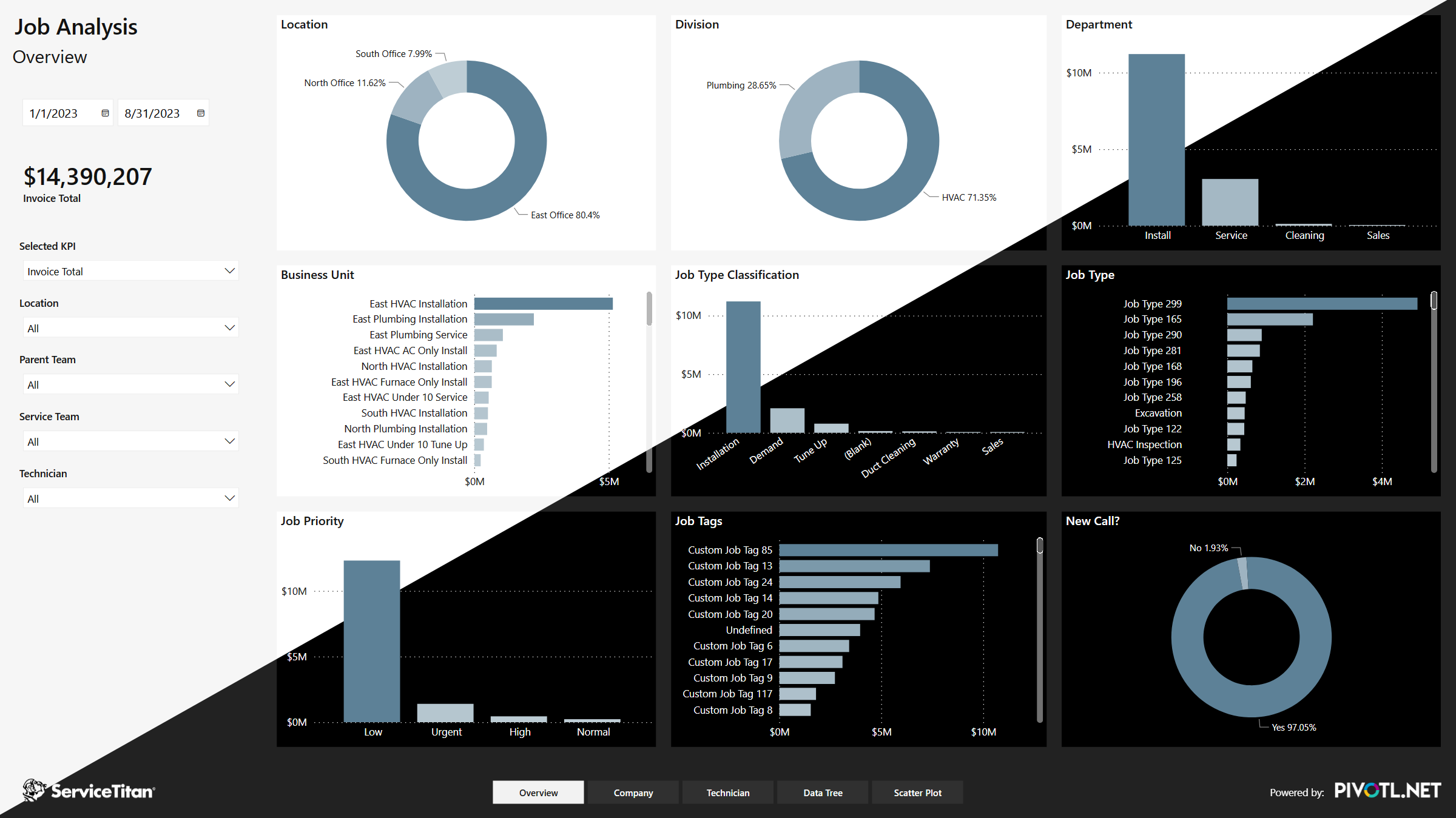
Analyzing the ways your company generates revenue is the golden ticket to increasing profitability. Business owners can make data-driven decisions in regard to their staffing, planning and pricing when they have statistics at their fingertips that show revenue trends and patterns. Setting goals and budgets for departments, managers and individual business units becomes simple when you can accurately measure multiple factors in each dialed-down category.
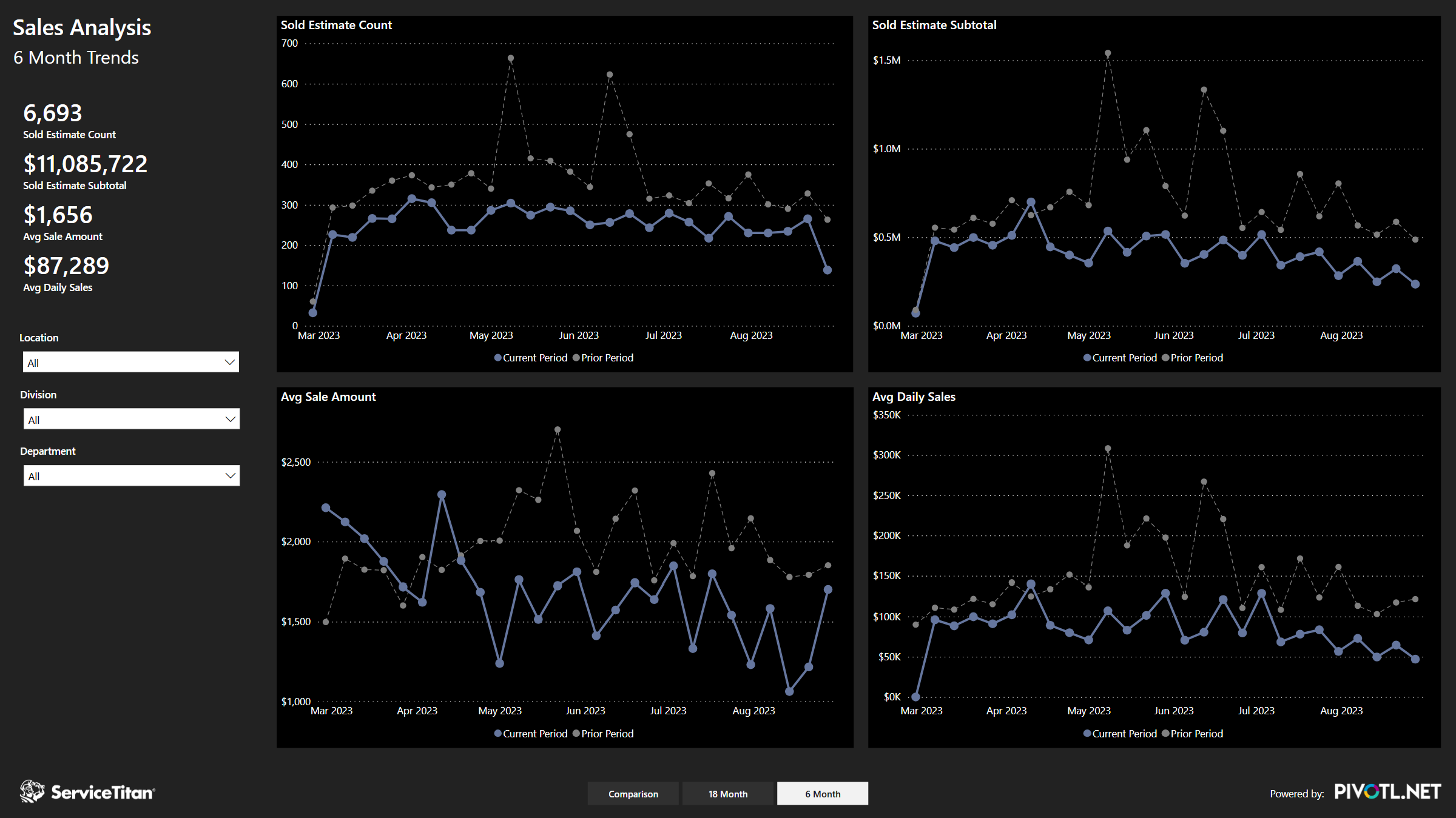
Sales Analysis
The best way to build effective sales strategies is to learn the components of what makes each of your sales successful. The Sales Analysis module enables business owners and managers to determine the sources that originate new sales opportunities, and identify which are most effective. Rate the quality of generated leads, assign sales revenue amounts, determine sales rep performance and much more to craft a more profitable sales program for your business.
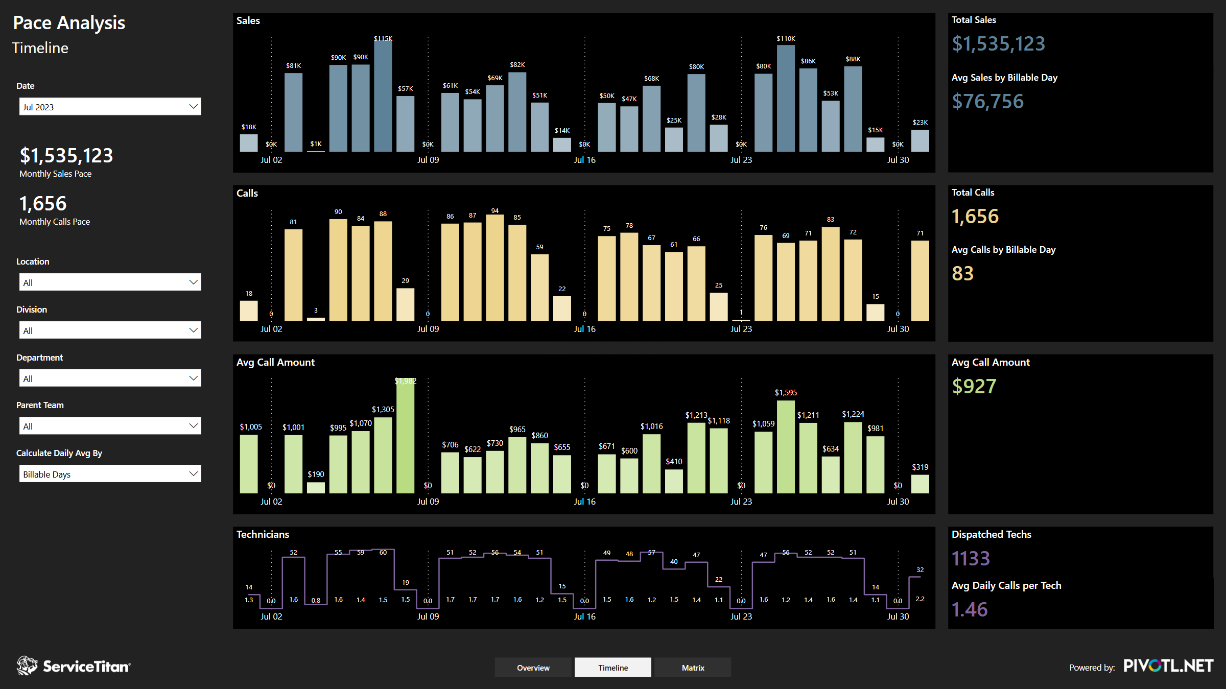
Pace Analysis
Business owners in the field service industry constantly need to make quick decisions based on short-term information that may have a major impact on long-term profits. That’s why it’s imperative they can access quick, accurate data that tells them exactly what they need to know in order to meet sales, call volume and productivity goals, and adjust daily goals accordingly.
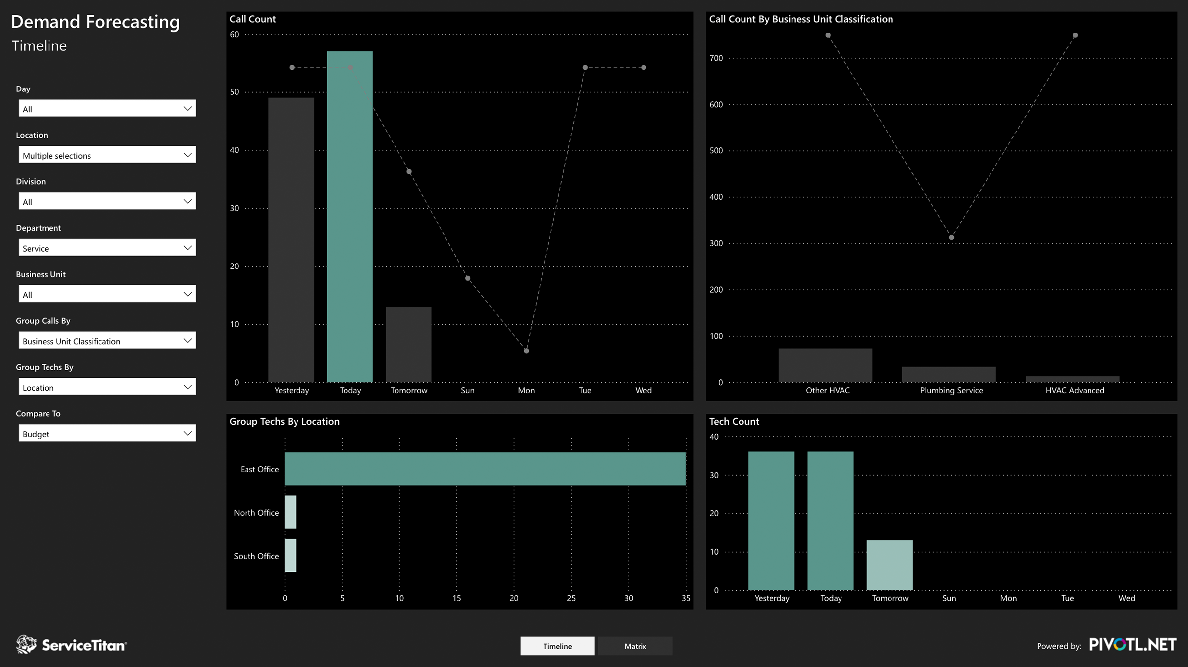
Demand Forecasting
Understanding call volume capacity is the cornerstone of a successful field service program. Managers who can anticipate technician availability and job assignments can successfully adjust each day in order to meet company targets, or create projections based on upcoming work. A demand forecast allows those managers to determine if the department is under, over, or at capacity, and make decisions to meet targets based on that data.
“PIVOTL’s Non-Profit Analytics have transformed the way we manage our fundraising activities. Shaun and his team designed 15 custom dashboards that integrate with our existing Bloomerang Donor Management software—opening up a whole new level of visibility into our data. Not only can we instantly track real-time progress toward our annual fundraising goals, but we can identify which donors to engage with specific campaigns and appeals. ”

Lisa Wood
CEO, Casa Teresa
Non Profit
“PIVOTL has created a series of QAD ERP dashboards that allow us to measure our sales against predefined monthly targets. We can see what projected sales for the quarter or year look like based on current trends. The team at PIVOTL set up our analytics so that managers and executives can see all the aggregated data while reps are only able to see their own performance metrics.”

Andrew Cormack
Chief Commercial Officer, phenox
Medical Device Manufacturing
“The real estate investment dashboard that PIVOTL created for Mobile Direct aggregates the performance of multiple, highly-sophisticated investment models—providing our team with detailed metrics about each asset and investor in our portfolio. Quarterly performance reports now take us minutes instead of days thanks to PIVOTL.”

DJ Burke
President, Mobile Direct
Private Equity
“PIVOTL Analytics enable our clients to measure and manage their businesses like never before. They now have instant access to their Prime Performance Indicators and can visualize the underlying factors impacting these results. Clients spend less time running static reports and inputting data into spreadsheets, and more time growing their companies.”

Kim Archer
President, Business Development Resources
Coaching & Consulting
03 | Power BI
Powered by the Industry’s Leading BI Platform
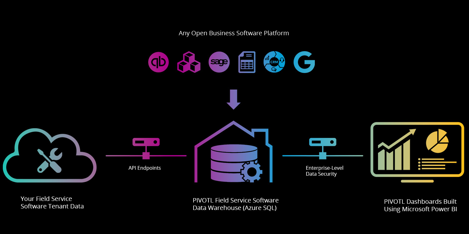
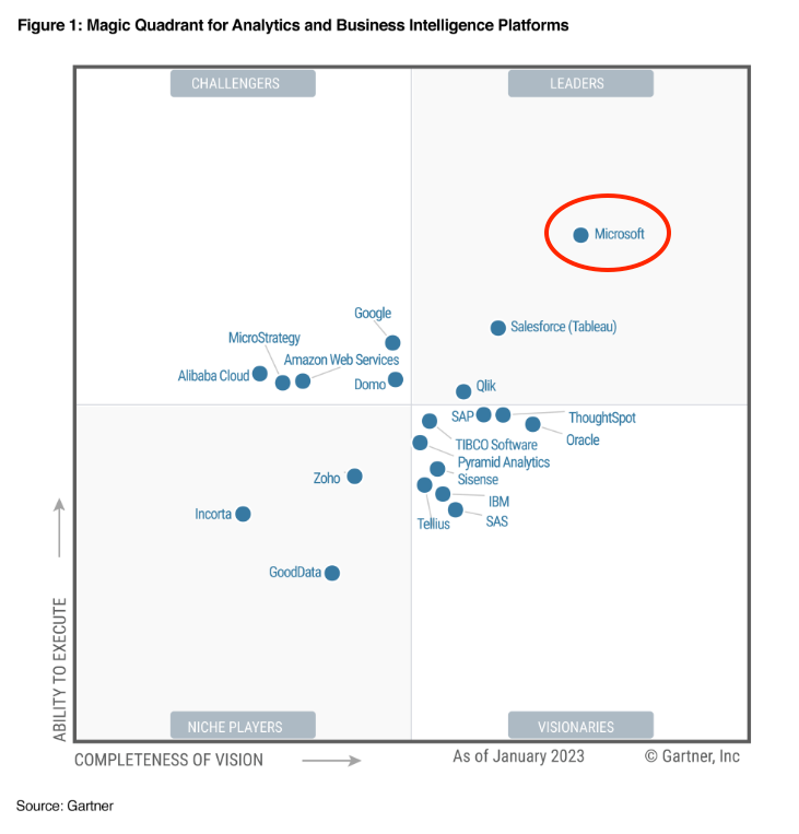
PIVOTL Analytics are built using Microsoft Power BI—ranked as the #1 business intelligence platform by Gartner for 16 years running. Power BI seamlessly connects to your cloud and on-premise data sources—storing your information in Microsoft’s highly secure Azure Data Lake.

Your options are limitless.
Purpose-built dashboards display key metrics that enable you to measure and rank perfomance across products, services, employees, locations or any other company-specific cohort.
Interactive timelines, slicers, charts, graphs, maps and tables allow you to group, sort and filter information across an unlimited number of parameters.
Inherit the enterprise-level data security of Microsoft.
PIVOTL analytics are fully integrated within the Microsoft 365 and Azure ecosystems.
Dashboard login is controlled using Azure Active Directory (AAD) and multi-factor authentication (MFA), while internal data access is restricted to whitelisted IP addresses only.
PIVOTL analytics can be securely viewed from your browser; dedicated Windows app; Apple iPhone, iPad and watch—or your Android tablet and phone.

Your company. Visualized.
- Over 300 Custom Third-Party Visuals
- Include Your Company Logo, Colors & Photos
- Near Infinite Layout & Data Density Combinations
- Choose Between Light & Dark Mode Display
- Slideshow Mode for Large Office Flatscreens
- Tailor the Depth of Analysis to Each Dashboard’s Target Audience

Your options are limitless.
Purpose-built dashboards display key metrics that enable you to measure and rank perfomance across products, services, employees, locations or any other company-specific cohort.
Interactive timelines, slicers, charts, graphs, maps and tables allow you to group, sort and filter information across an unlimited number of parameters.
Inherit the enterprise-level data security of Microsoft.
PIVOTL analytics are fully integrated within the Microsoft 365 and Azure ecosystems.
Dashboard login is controlled using Azure Active Directory (AAD) and multi-factor authentication (MFA), while internal data access is restricted to whitelisted IP addresses only.
PIVOTL analytics can be securely viewed from your browser; dedicated Windows app; Apple iPhone, iPad and watch—or your Android tablet and phone.

Your company. Visualized.
- Over 300 Custom Third-Party Visuals
- Include Your Company Logo, Colors & Photos
- Near Infinite Layout & Data Density Combinations
- Choose Between Light & Dark Mode Display
- Slideshow Mode for Large Office Flatscreens
- Tailor the Depth of Analysis to Each Dashboard’s Target Audience
04 | Custom Analytics
Unleash Your Data
Our custom analytics seamlessly integrate with your existing business applications—unleashing a wealth of rich operational data locked inside.
Gain Critical Insights from Hundreds of Systems
Don’t see an integration for your line-of-business software? We can build custom connectors and leverage integration middleware to access data from nearly any modern data platform.
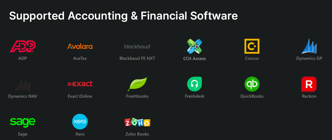
Accounting
Learn More
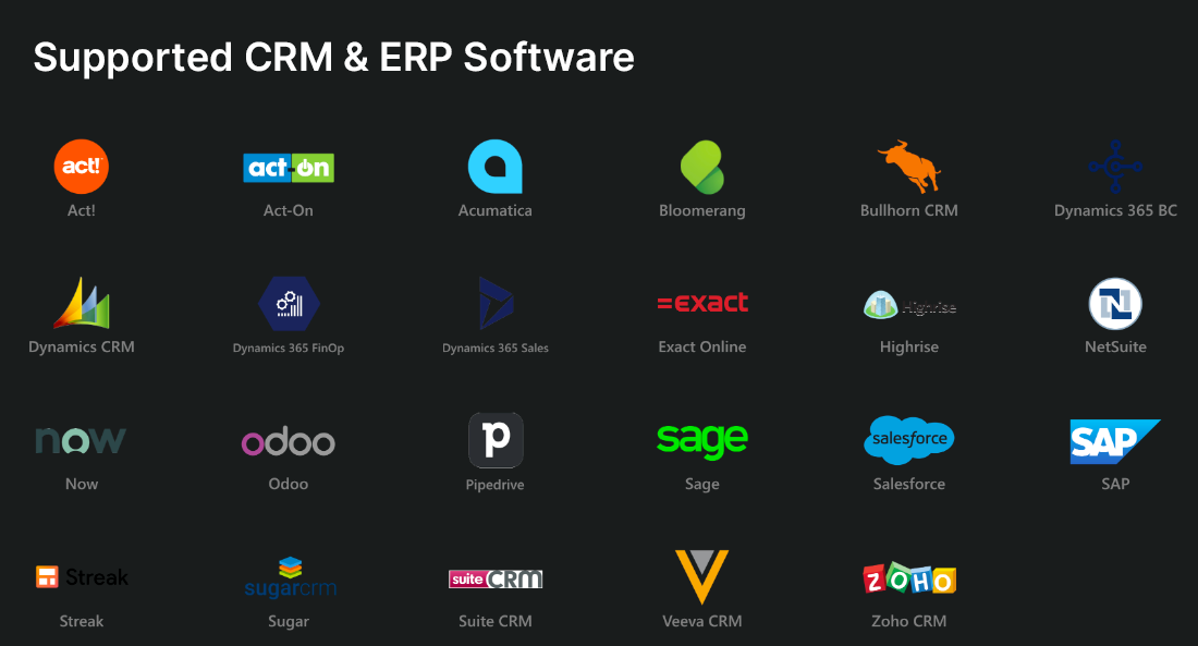
CRM & ERP
Learn More
Marketing
Learn More
Operations
Learn More
Databases
Learn More
Files & API
Learn More
The Transformative Power of Data-Driven Decision Making
Professional development and implementation of enterprise-level analytics will have a transformative effect on nearly every area of your operation. This powerful addition to your technology ecosystem allows you to:
Get Clear Answers to the Right Questions
- No more manual report-running and number-crunching.
- Gain instant access to your key performance metrics.
- Group and rank metrics by team, employee, service, division, region or any other cohort unique to your business.
- Compare performance to previous periods, targets and company-wide averages.
- Identify the underlying reasons behind your results.
Make Decisions That Drive Growth & Profitability
- Get out ahead of small issues before they become big problems.
- Create a culture of transparency and accountability.
- Align individual incentives with company-wide goals.
- Understand exactly where to focus your finite resources.
- Dominate your market.
“PIVOTL’s Non-Profit Analytics have transformed the way we manage our fundraising activities. Shaun and his team designed 15 custom dashboards that integrate with our existing Bloomerang Donor Management software—opening up a whole new level of visibility into our data. Not only can we instantly track real-time progress toward our annual fundraising goals, but we can identify which donors to engage with specific campaigns and appeals. ”

Lisa Wood
CEO, Casa Teresa
Non Profit
“PIVOTL has created a series of QAD ERP dashboards that allow us to measure our sales against predefined monthly targets. We can see what projected sales for the quarter or year look like based on current trends. The team at PIVOTL set up our analytics so that managers and executives can see all the aggregated data while reps are only able to see their own performance metrics.”

Andrew Cormack
Chief Commercial Officer, phenox
Medical Device Manufacturing
“The real estate investment dashboard that PIVOTL created for Mobile Direct aggregates the performance of multiple, highly-sophisticated investment models—providing our team with detailed metrics about each asset and investor in our portfolio. Quarterly performance reports now take us minutes instead of days thanks to PIVOTL.”

DJ Burke
President, Mobile Direct
Private Equity
05 | CCH Axcess
CCH Axcess™
Practice Management Analytics
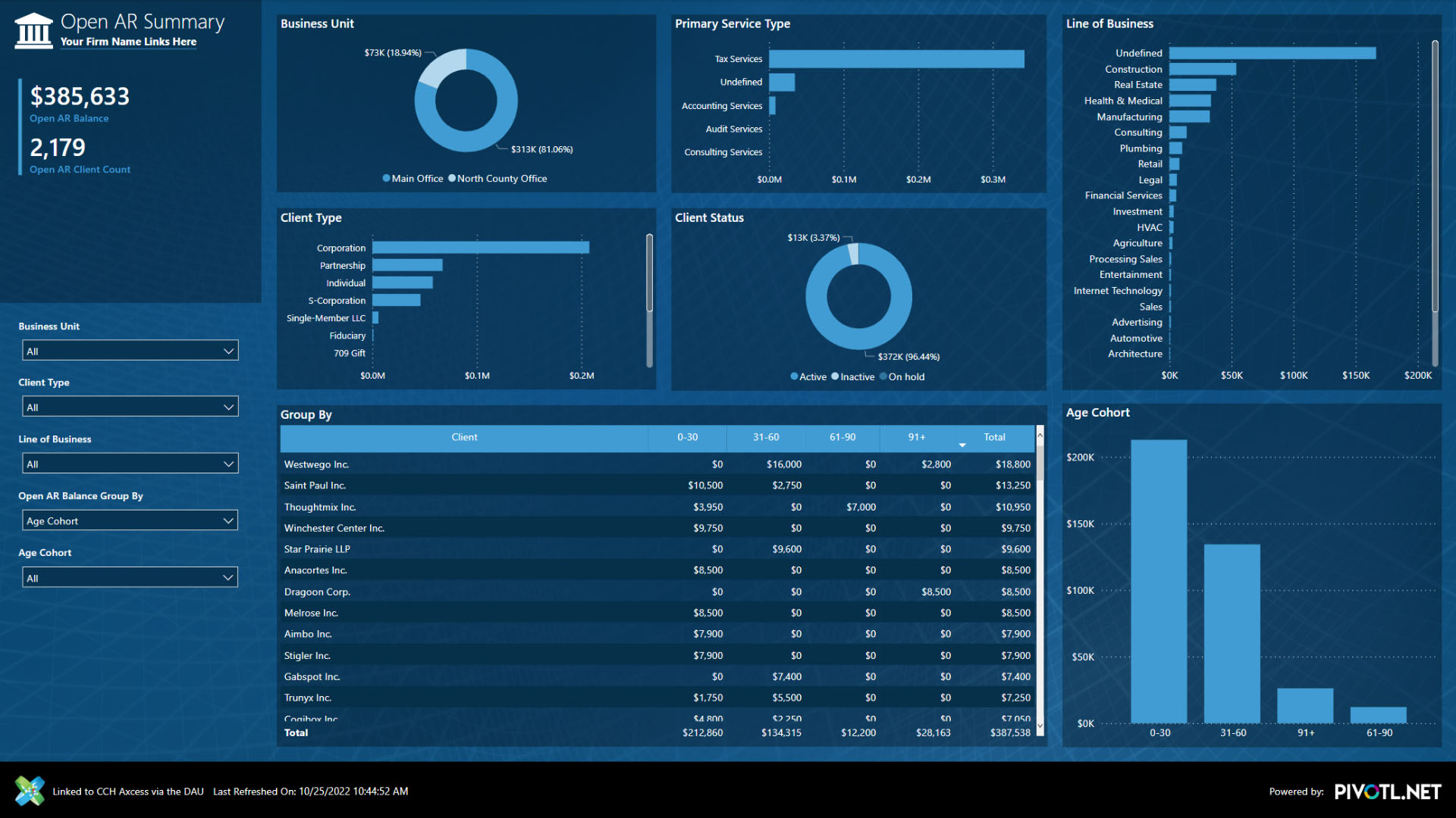
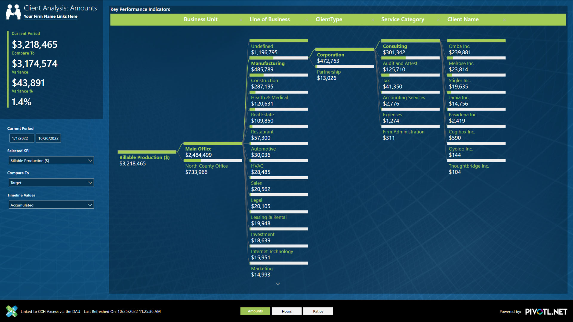
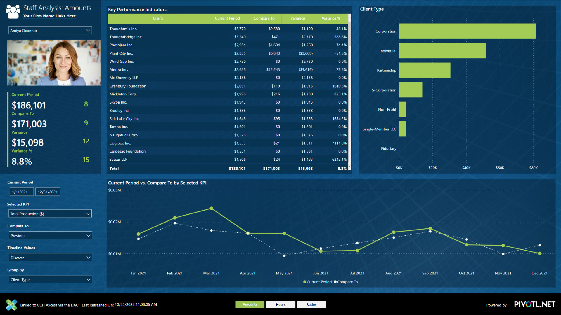
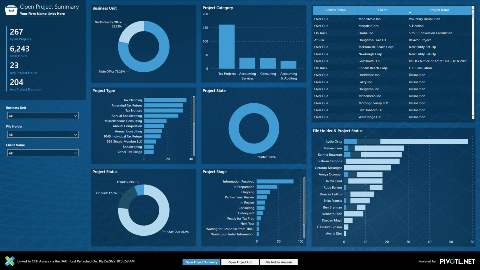
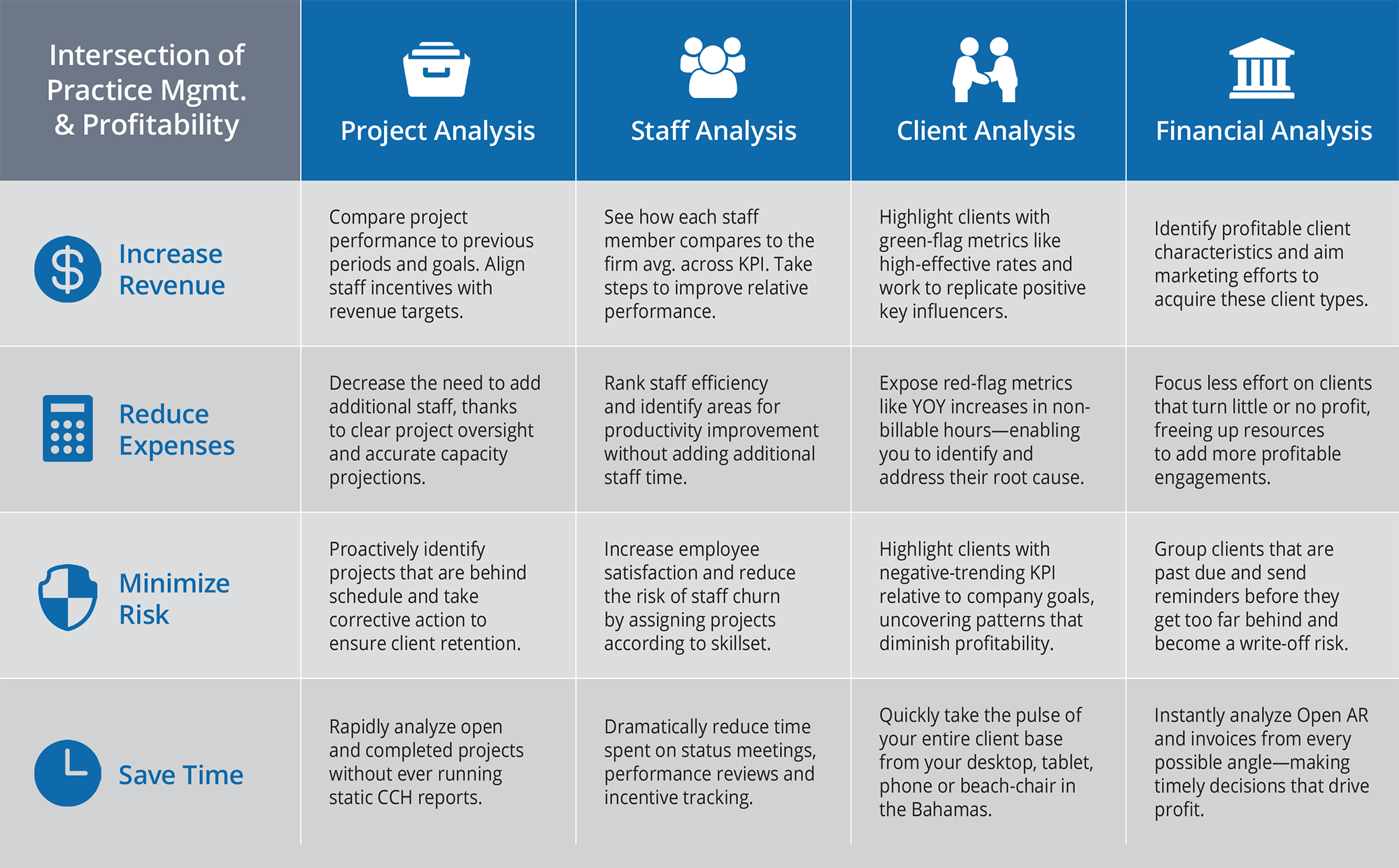
Gain even more value from your CCH Axcess investment by seamlessly integrating enterprise-level business analytics built specifically for your firm. Dozens of interactive, purpose-built dashboards give you the insight you need to make smart, proactive decisions that drive profitability.
Financial Analysis
When leaders have a holistic view of company financials, you’re able to make clear decisions that impact profitability and growth. Building an analytics strategy in harmony with your practice management software gives a bird’s eye view of your firm’s performance, while establishing clear areas for process and work product improvement. Gain full visibility into revenue and profitability, trends and an up-to-date status of your firm’s financial results.
Client Analysis
Having access to smart data about your clients helps you build better client service packages and targeted marketing efforts based on your firm’s most profitable client profiles. Gain full visibility into the percentages of profitability, types and demographics of your “rock star” clients.
Staff Analysis
Understanding your staff’s capacity, time and capabilities enables you to make many important decisions about your firm, including service pricing, scheduling, compensation, training and hiring needs. Gain full visibility into the capacity, projected time budgets and strengths/weaknesses of your staff.
How PIVOTL Practice Management Analytics Drive Profitability
“By integrating PIVOTL with CCH Axcess, no longer am I running pages and pages of reports, when analytics dashboards instantaneously show me the metrics I need to know to run my business profitably. I don’t spend my day wondering if projects have fallen through the cracks, or puzzle over unpaid invoices or if my staff might be over capacity. I’m a more informed manager and feel confident each day that I’m making smart decisions on behalf of my clients, and staff.”

Enrique Sanchez
President, E.G. Sanchez, CPA
06 | About Us
What Drives Companies to Hire PIVOTL
We are on an all-out mission to bring the financial benefits and competitive advantage of enterprise-level business analytics to small and midsize organizations just like yours. From concept to creation, our small, elite team has the knowledge, experience, commitment, and character needed to guide your analytics project to completion.
Our Ideal Clients:
- Realize that they already have much of the data they need in order to make smart decisions but don’t have a good way to collect, analyze and share that data with those who need it.
- Have a data-driven mentality and are prepared to implement the system-level changes and business process recommendations required for success.
- Are large enough to invest in a robust analytics solution, but not so big that they’d be better served by a full-time, in-house team.

